Starting last year, we created an accompaniment to our beloved feature on the great performances of the year, a piece designed to elevate the filmmaking elements that don’t seem to get enough attention throughout the year. Accomplishments in music, cinematography, costume design, editing, and even giant monster creation were selected by our staff, offering an incomplete but impressive look at the best craftspeople in the industry. Enjoy.

Costume Design, Holly Waddington, “Poor Things”
Costume designer Holly Waddington’s secret weapon in Yorgos Lanthimos’ sci-fi period tale is the usage of Victorian designs, made with modern fabrics to invoke both the past and the future. Resurrected from a suicide attempt by “God” (as in Godwin Baxter, played by Willem Dafoe), Bella Baxter (Emma Stone) is first attired like a child, with a sly twist: though her “baby” clothes feature unruly ruffles and quilted fabrics (reflecting the infantilization at the hands of God and the housekeeper), the ruffles are made of plastic, and their shape resembles female genitalia (i.e., bisected orifices). Large puffy Victorian sleeves are used to exaggerate both Bella’s frame and madcap personality, while the need to protect her is reinforced through the puffer coat bustle cage. Pastels take over during her sexual sojourn with Duncan Wedderburn (Mark Ruffalo, himself attired like a Victorian caricature).
Newly liberated from a maid’s supervision, Bella mismatches her ruffled tops with tap shorts and long velveteen skirts. The Parisian brothel (run by the delightful Kathryn Hunter, dressed in gaudy brocade and full-body tattoos) where Bella lands up features not a single corseted woman, entirely out of place in a film about freedom. Instead, she dons a latex raincoat that looks like a condom, and later, loose fitting lingerie in nude tones, a celebration of her ownership of and comfort with her own body.
Bella’s socialist/med school era speaks to her ability to make decisions for herself: black coats, in heavier fabrics, popular with men in France at the time, to fit in better with the majority-male population at school, although sans skirt, because Bella is still Bella. It’s only when she meets her ex-husband, a sadistic military general, that we glimpse how the man’s toxicity influenced her attire: a hideous orange gown, the first in the film to need a corset (though Bella goes without), paired with a brown-ish purple sailor collar and bodice. She was never happy nor comfortable in her Victoria Blessington days, as the armor-like blue gown in which she jumps from a bridge indicates, which is why her clothes in the final scene—a cozy, fuzzy cream-colored turtleneck sweater and a long toffee-hued skirt, as she happily sips tea—feel like pure sartorial redemption. – Nandini Balial
Original Score, Ryuichi Sakamato, “Monster”
Hirokazu Kore-eda’s latest film “Monster” is an exercise in mourning, made all the more meaningful through the work of master composer Ryuichi Sakamoto in his last film score before his passing. Sakamoto infuses a sorrowful yearning into each beat as every movement of the score settles into the melancholy Kore-eda is capturing as we discover humanity’s finite abilities to truly know someone else.
The score aches with longing as the two boys at its center grapple with a world whose harsh expectations of them threaten to erode their natural kindness and compassion. As the film develops, the score blooms from simple, piano-driven structures entrenched in mystery to movements that explore different sonic textures, such as accordions and violins.
All of this culminates in the moving final number, “Aqua,” which overflows with rich sounds, hopeful in its flow compared to how the film and accompaniment started. It fits the change in the dynamic and perspective of the film. The opening notes of the film, slow and hypnotic, work in contrast with the lively, almost celebratory sounding notes the score ends on as the film takes in the world through the eyes of the child. This is especially true when the thrum and power of major chords play in the midpoint, signaling something new and how the song is split into three acts themselves, the last indicated in a buoyant key change. The story might end on a note of ambiguity that will make your heart ache, but there’s comfort in the final movement, recalling the familiarity of a lullaby. – Ally Johnson

Editing, Lee Chatametikool, “All Dirt Roads Taste of Salt”
Like a lot of tech elements, particularly things like make-up and cinematography, it’s usually the flashiest editing, or “most” editing that gets the most attention at the end of the year. There have been remarkably well-cut epics this year like “Oppenheimer” and “Killers of the Flower Moon,” two long films that would be much more of a slog without their fluid visual language. There have been excellent action films like “John Wick: Chapter 4” and “Mission Impossible: Dead Reckoning – Part One” that used their editing to amplify their hero’s journey. However, the best editing of the year was the most poetic, an approach to filmmaking that recalls Terence Malick and Apichatpong Weerasethakul in its intertwining of images that feels more like poetry than prose.
It makes sense that Lee Chatametikool’s work on Raven Jackson’s excellent “All Dirt Roads Taste of Salt” has that surreal poetry of Joe’s work given that he cut a lot of the filmmaker’s projects, including films in which the assembly is essential to the impact like “Memoria” and “Uncle Boonmee Who Can Recall His Past Lives.” The Thai editor collaborated with Jackson to help shape her deeply tactile, rich piece of storytelling in a way that’s more of a high-wire act than people have appreciated. The structure of “All Dirt Roads Taste of Salt” feels organic in the way that a smell can remind you of a person, but that doesn’t happen easily. Editing a film is like putting a puzzle together, and Jackson and Chatemetikool form a picture that feels like it’s coming straight from something as fluid as memory. We hear it, smell it, and feel it as much as we see it. And Jackson deserves more praise than she’s getting for that accomplishment, but it also falls apart without an editor who’s proving himself one of the most interesting in his field. – Brian Tallerico

Cinematography, Eigil Byrld, “The Holdovers”
One of the most remarked-upon features of Alexander Payne’s melancholy 1970s-set Christmas comedy-drama “The Holdovers” is its 1970s look, down to slight imperfections in the opening that make it look like a celluloid presentation. That kind of self-consciousness has the whiff of a certain meta inside joke, and it’s a fact that Payne has, in the past, crafted films that have both a look and overall vibe reminiscent of free-wheeling, emotionally complex films of the late 20th century; his well-loved “Sideways,” from 2004, felt Altman-esque and Ashby-esque in nearly equal measure.
The cinematographer Eigil Bryld has substantial experience in creating specific and consistent moods and has also proven himself in the realm of what we’ll call the “memory play.” Witness the stark black-and-white horror of his work in 2000’s “Wisconsin Death Trip,” or the autumnal tones of David Chase’s recollection of growing up in suburban Jersey in the ‘60s wanting to be a rock star drama “Not Fade Away.”
Working in the digital realm behind the camera on “The Holdovers,” Bryld crafts a look that’s convincingly “film” like without feeling anachronistic; it’s intimately involved in the spaces it depicts, including cozy but somehow oppressive private school office and sleeping quarters and snow-covered grounds suddenly deprived of their usual population. Payne and Bryld stage arguments between the movie’s stranded students as if we’re possibly uncomfortable nearby observers. Once the action shifts briefly to Boston for an unauthorized field trip during which dyspeptic prof and angst-absorbed student come to understand each other, and find a bond, the wet sidewalks bring home the idea of ice slowly melting. Their work brings yesterday into today with an immediacy that envelops the viewer in the movie’s emotion. – Glenn Kenny

Editing, Mike Andrews, “Spider-Man: Across the Spider-Verse”
From the playful mashup of comic fonts and video game graphics that assault the movie’s opening Columbia Pictures logo, you can immediately tell there’s something different at work with “Spider-Man: Across the Spider-Verse.” But editor Mike Andrews (an animation veteran who worked on the “Shrek” movies, among many others) is so incredible here that it challenges your very notion of what film editing is.
There’s a thing Andrews does throughout the film, where he makes montages out of a rapid-fire series of shots (with each shot coming in a wildly different animation style, from a different reality), even as the scene these shots are occupying is not, itself, a montage. Because the movie is playing with the idea of alternate realities crashing in on themselves, Andrews approaches each scene like the finest sample DJ, constantly pulling in snippets and flashes, while keeping the overall scenes grounded in normal, linear movie time. “Across the Spider-Verse” turns film editing into a Paul’s Boutique-esque playground, where anything can be pulled into the alchemy at any moment, while the narrative focus on the greater whole is never compromised. The cinematic landscape is all the better for it. – Daniel Joyaux

Costume Design, Cynthia Lawrence-John, “Rye Lane”
Pink shoes. That is all of Dom (David Jonsson) first seen by Yas (Vivian Oparah), the woman he will spend the rest of the movie getting to know. He sobs in a bathroom stall, and she peeks at the only part of him she can see. It will take 82 minutes of them wandering around the neighborhood of the title before they know they are meant to be together. But those of us paying close attention will figure it out very quickly because in the most colorful film of the year, filled with bright, vibrant, saturated hues, the color of the purse Yas is carrying is pink like Dom’s shoes, giving us an immediate subliminal message about their connection.
That was a signal from costume designer Cynthia Lawrence-John, whose wise and witty choices give us the visual expression of the couple’s personalities. They more than meet two challenges of the story. First, the wardrobe had to stand out amid the lush, vivid colors of the settings. And second, costume reveals character. Yas works in fashion and wants to be a costume designer, so her attire has to reflect her flair and special attention. Dom, an accountant, wears clothes that are more mainstream and subdued, but he has some unexpected flair, too, at the art show where they meet—remember the pink shoes. And both have clothes that, with the help of cinematographer Olan Collardy, perfectly set off the glowing skin tones of the actors, especially the tops with shades of ochre and goldenrod. Watch for the contrast with the understated and rather boring clothes worn by the characters’ exes and their new partners. Like all great costume designers, Lawrence-John knows how to delight our eyes, illuminate the characters, and help to tell the story. – Nell Minow
Original Score, Robbie Robertson, “Killers of the Flower Moon”
From the time that they first worked together on the landmark concert film “The Last Waltz,” musician Robbie Robertson has served as one of Martin Scorsese’s key collaborators, helping to produce the soundtracks to a number of his films. For “Killers of the Flower Moon,” Robertson composed the score and rather than the standard orchestral score that one might have expected from a large-scale historical epic, he instead a guitar-based work that beautifully complemented the shifting emotions of the film’s sprawling narrative in ways that quietly evoked its quietly building sense of anger, horror and sorrow while helping to drive the story along over the course of its extended running time. At the same time, the sounds that he has created here, informed in no small part by his own First Nations ancestry, is compelling enough that they retain their power even when heard separate from the movie.
The end result is a lovely and haunting work that is an indispensable contribution to one of the year’s best films that also works as a vital component to his musical career as a whole. Sadly, Robertson passed away in August, but as a capper to both his creative collaboration with Scorsese and his entire artistic legacy, this stunning creation finds him going out on the highest of notes. – Peter Sobczynski

Cinematography, Maria von Hausswolff, “Godland”
For our honeymoon last summer, my wife and I selected as our honeymoon destination the country of Iceland, which I had previously visited in 2018 to cover the Reykjavík International Film Festival. Courtesy of our travel agency, Nordic Visitor, we were provided a rental car that enabled us to drive along the perimeter of the continent and savor one astonishing sight after another, from vertiginous cliffs upon which sheep grazed and towering waterfalls to sulfur-spewing volcanoes and icebergs surrounded by wind so fierce, it blew out multiple car windows and flipped over a van before my eyes. The country’s geographical contradictions are lensed brilliantly by Maria von Hausswolff in Hylnur Pálmason’s haunting epic, “Godland,” the very title of which illustrates the tension between conflicting entities—the spiritual and earthbound, the terrible and beautiful, Danish and Icelandic, ice and fire.
An early title card informs us that the film’s imagery was inspired by photographs taken by a Danish priest in the late 19th century, an assertion that is apparently no more factual than the Coen Brothers’ claim that “Fargo” was based on a true story. Yet there isn’t a frame of Pálmason’s film that isn’t utterly convincing, as its aforementioned priest, Lucas (Elliott Crossett Hove), photographs his surroundings with a camera, the lens of which is mimicked by Von Hausswolff’s 1.33:1 aspect ratio—complete with curved edges—that captures both the vastness of the landscape and the priest’s mounting sense of entrapment. On his journey toward building a church near the home of a farmer, Carl (Jacob Lohmann), and his daughters, Lucas harbors a resentment toward his Icelandic guide, Ragnar (Ingvar Sigurdsson), that leads the pair of them to commit unforgivable acts.
The insignificance of man in the face of nature’s indifference is conveyed in a way similar to Malick’s “Days of Heaven,” as Von Hausswolff frames the characters from extreme high angles or in wide shots that make them appear as diminished as the insect we fleetingly see crawling upon Lucas’ eyelashes. Von Hausswolff’s cinematography is never more mesmerizing than it is at its slowest, such as when the camera pans down a seemingly endless waterfall for nearly two minutes while Ragnar recounts the tale of a nightmare that “felt like an eternity,” or the shot that runs almost five minutes of the ailing priest lying in a field that foreshadows the film’s final moments. After Lucas has met his terrible fate, von Hausswolff chronicles from the same fixed angle the spectacular changing of seasons until Carl’s young daughter (a revelatory Ída Mekkín Hlynsdóttir) emerges to assure him that his contributions to the land will indeed be beautiful. – Matt Fagerholm
Original Score, Ludwig Göransson, “Oppenheimer”
Adhering to the suggestion made by Director Christopher Nolan to center the score for “Oppenheimer” on violin, Composer Ludwig Göransson created a soundscape for an overloaded mind. First, as a way to show how Robert Oppenheimer envisions molecules moving and striking each other, but also to showcase Oppenheimer’s restlessness. One of the most captivating pieces of music from Göransson’s score appears early in the film. “Can You Hear the Music?” is set to a montage of visual effects with repetitive patterns from the orchestra that builds with a shifting tempo. Layered with a synthesizer over the violins, the track is beautiful and tense due to its momentum.
Göransson’s score does a lot of the heavy lifting when it comes to suspense in “Oppenheimer”—for a three-hour film, this driving score keeps the story moving. While the editing from Jennifer Lame is a big reason for that as well, there’s no way the film succeeds without Göransson. Conversely, some of the most impactful moments in the film are due to the absence of sound. Take, for instance, The Trinity Test which shows the world Oppenheimer’s great achievement—it’s mostly silent, and the omission of sound is the most profound element of the explosion. Another striking sequence is when Oppenheimer is giving his speech at Fuller Lodge following the bombs dropping on Hiroshima and Nagasaki. The moment is supposed to be celebratory, but the persistent clapping and haunting score turn glory into horror. It’s the closest that the film comes to recognizing the atrocity of the atomic bomb. As visually impressive as “Oppenheimer” is, there’s no question that Göransson’s score is equally responsible for the brilliance of Christopher Nolan’s achievement. – Max Covill

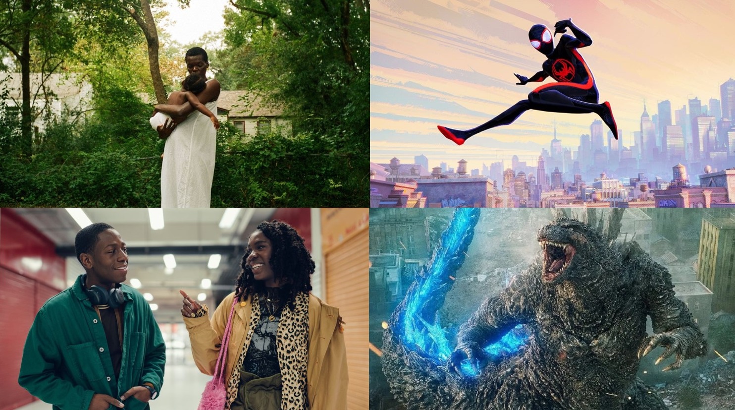
Creature Design, “Godzilla Minus One”
No one tasked with re-envisioning Godzilla has an easy burden to shoulder. Years of Toho product growing sillier and sillier and American movies completely cheapening the idea of Godzilla may have reduced some of the king of the monsters’ symbolic potency in the public eye, but that has not removed the import from the idea of Godzilla. When you make Godzilla movies in Japan, you are touching the nation’s foundational tragedies, the loss of the collective self, the destruction of a national identity. Hideaki Anno’s idea a few years back is to treat Godzilla as a direct externalization of the response to the Fukushima disaster, which paid rich dividends indeed, creating a stealth contender for the greatest film of the 2010s. Prolific (though unknown in the US) Takashi Yamazaki went the alternate route, plunging right back to the moment that produced a need for Godzilla’s metaphorical rampage in the first place.
Godzilla’s size and bulk, his terrible power, was impressive in Ishiro Honda’s 1954 film, but there was also an element of animalistic tragedy to him. He was made by our folly and killed for the same reason. Yamazaki’s Godzilla is the first Godzilla that has been truly terrifying, the tragedy sucked from his eyes as he is refashioned as a malevolent challenge to the idea of rebuilding Tokyo after its destruction at the hands of the allies. Godzilla is now America, and as such he must be terrible, he must have nothing but murder in his eyes, and Yamazaki, who also served as the effects director, has made a Godzilla of horrific power, his scales shifting into place before unleashing his own nuclear blast onto an already humbled people. You believe both his aquatic agility and lumbering pace on land, you believe he could destroy the world, and you applaud and wipe the tears from your eyes when he is destroyed. Or anyway, I did. – Scout Tafoya

Costume Design, Stacey Battat, “Priscilla”
“Priscilla” costume designer Stacey Battat, who created a whopping 120 looks for actress Cailee Spaeny, uses the styles of the changing eras to chart the emotional journey of Priscilla Beaulieu from her first teenaged meeting with superstar Elvis Presley in 1959 to her moment of self-actualization as she leaves her husband in order to live her own life in 1972.
Priscilla the girl is first introduced wearing a baby pink sweater, a plaid schoolgirl skirt and a sporting ponytail. Through their early dates, she wears similar conservatively youthful attire, including Peter Pan collared blouses, pastel sweater sets, and full, petticoated skirts. After moving to Graceland, the pastels and saddle shoes remain for school, but in a life with Elvis comes richer fabrics; satin and lace abound, although often with girly touches like bows and daisies. As his controlling grip increases, he forbids her to buy clothes on her own, dressing her up like a doll in rich brocades and floor-length gowns. He even suggested she dye her hair jet black, which becomes a full bouffant by the time gives birth to their only child, Lisa Marie. Gone are the playful silhouettes and muted pastels of girlhood in favor of formless shift dresses in deep pinks and corals and yellows.
She adopts a more counter-culture style as their marriage falls apart, dressing in dark greens and blues and even some funky purple bell bottoms. Finally, when Priscilla the woman, her hair, once again its natural light brown, gets behind the wheel to leave her gilded cage with Elvis behind, she wears a crisp white button up. At last, her wardrobe, like her life, is a blank canvas on which she can choose what to paint. – Marya E. Gates

Cinematography, Laura Valladao, “Fremont”
In “Fremont,” which tells the story of a former Afghan translator adrift in the titular California city, longing for connection, lead actress Anaita Wali Zada is often center-framed with a still gaze, as if addressing the camera directly. A journalist and first-time actor, her understated performance is a wonder to witness, emanating the same warm, quiet glow that ultimately defines co-writer/director Babak Jalali’s luminous melodrama without for a moment suggesting anything contrived or actorly about her character’s dry wit and hidden reserves of feeling.
Shooting digitally in black-and-white with a boxy 4:3 aspect ratio, director of photography Laura Valladao—herself a Fremont native—proves essential to this effect, achieving a visual language of deadpan naturalism that is at once honest and artful, stylized by formal restraint and a strain of melancholic humor. In her static, elegantly composed frames, the city is a lonely place that yet shimmers with potential. Transformed by Valladao’s focus on texture and space, apartment complexes, mechanic shops, psychiatrists’ offices, and a fortune-cookie factory floor all emerge as unlikely sites of human connection, where those with burdensome pasts can contemplate their ephemeral futures.
Striking a particularly poignant balance between darkness and light, drawing a coexistent presence and distance out of locations as well as characters, Valladao’s work illuminates wide-open possibilities in the faces of the city’s immigrant population and the in-between places where they find themselves, also surfacing their daily struggles and sadnesses, the weights they still carry. Inspired by the photography of Graciela Iturbide, Shelby Lee Adams, and Antanas Sutkus, as well as by more recent black-and-white films like Jim Jarmusch’s “Stranger Than Paradise,” Béla Tarr’s “Damnation,” and Rebecca Hall’s “Passing,” Valladao and Jalali clearly grasp the truth-telling power of portraiture, its ability to convey a subject’s personality, emotions, and innermost thoughts. Their collaboration makes quotidian poetry of a refugee’s search for community and—with rare, light charm—evokes the larger, universal absurdity of starting over. – Isaac Feldberg
Original Score, Joe Hisaishi, “The Boy and the Heron”
To be frank with you, I am less enthusiastic than many reviewers about Hayao Miyazaki’s latest animation film “The Boy and the Heron”, even though I was glad just like others for his belated comeback. Probably because of several reasons including its rather broad and murky storytelling, watching it felt more like an exercise than an entertainment to me, and this impression of mine was not changed much even after I watched it again at a movie theater.
Nevertheless, I admire “The Boy and the Heron” enough because of its many top-notch technical aspects including the score by Joe Hisaishi, who has steadily collaborated with Miyazaki for almost 40 years since “Nausicaä of the Valley of the Wind”. Frequently led by a solo piano performance, his score for “The Boy and the Heron” is relatively more modest and restrained compared to many of his previous works for Miyazaki’s films, but it still brings a palpable sense of wonder and enchantment to a number of truly wonderful visual moments such as the one showing a bunch of little white creatures flowing up to the sky. In addition, it deftly illustrates the emotional undercurrents of the story without overstepping at all, and that is why we come to sense more of Miyazaki’s wisdom and sincerity behind the film. This is surely another commendable result from the longtime collaboration between Hisaishi and Miyazaki, and I sincerely hope that they will continue to work together as long as possible for giving us more awe and excitement. – Seongyong Cho

Creature Design, “The Lake”
You don’t always get a clear or direct view of the monster in “The Lake,” a superior creature feature from Thailand. Most of the time you see the monster through the eyes of whoever’s unfortunate enough to run into them. Sometimes we even see the world through the monster’s blurry, adrenalized eyes. Moreover, when we do get a look at the monster—or one of the monsters—it doesn’t just look like the castaway spawn of Bong, Del Toro, and Spielberg, among others. It looks like a credibly menacing dinosaur-sized reptile, with chin spikes, egg-yolk orange eyes, and webbed fins draped over its shoulders, too.
How, then, to praise “The Lake” without over-selling the importance of what the special and visual effects teams accomplished? They didn’t deliver an original-looking monster, exactly, but they did make one that moves with its own B-movie integrity and is presented throughout the movie like a threat that’s worth hiding behind torrents of rain, blurry subjective photography, and front-lit close-ups of human characters’ troubled and/or unsuspecting faces.
It’s a good monster because, while it was obviously made on a budget, that doesn’t really matter when you look at it. Rather, you’re straining to see who’ll get jumped next, and then waiting for the creature’s next appearance. “This would be a good movie to watch with popcorn and soda,” my partner Jene said after she wandered into the living room and heard screams coming from the TV. And she’s not even a movie geek! – Simon Abrams

Costume Design, Francine Jamison-Tanchuk, “They Cloned Tyrone”
The fantastical, vibrant, and soulful world of “They Cloned Tyrone” was brought to life by a multitude of elements. From cinematographer Ken Seng, production designer Franco-Giacomo Carbone to Erykah Badu’s rendition of ‘Tyrone’ in the end credits, these contributors made the film the most memorable of the year. However, it was the costume design that truly made this world feel lived in and immersive. Much of this success can be attributed to the film’s costume designer, Francine Jamison-Tanchuck, renowned for her work on “One Night in Miami,” “Detroit,” and “Boomerang.”
The moment characters like Fontaine, Yo-Yo, or Slick Charles walked onto the screen, their costumes began to tell a story. Fontaine’s signature dull green hoodie and military-like jacket depict a character who seeks to maintain a low profile. Like a drug dealer in many neighborhoods, he aspires to be a background character, avoiding suspicion and simply focused on securing his bag. His uniform symbolizes the mundane day-to-day life of the working class, exuding a gangsta swagger and reflecting a sense of having little to live for.
In contrast, Slick Charles’ wardrobe is vibrant and attention-grabbing. Adorned in a purple suit, bell bottoms, a gold chain, and rings, he deliberately seeks to draw attention to himself. A character rooted in the past, Slick Charles showcases a flamboyant style that stands out. Yo-Yo’s attire, featuring mustard yellow thigh-high boots, chaps, leopard print, faux fur, and blue lipstick, paints a picture of a character beyond the conventional working girl. She emerges as creative, ambitious, and clever, traits that become increasingly evident as the movie unfolds.
With just a silhouette, one could instantly recognize and understand each character. “They Cloned Tyrone” successfully captures the essence of black fashion throughout the decades, paying homage to iconic films like “Superfly” and “Shaft.” Through its vivid and memorable costume choices, the film not only celebrates style but also serves as a testament to the power of fashion in storytelling, making it a standout cinematic experience of the year. – Brandon Towns