Film criticism: It’s not just a job, it’s an adventure

View image Glenn Kenny’s blog: Bought and paid for.

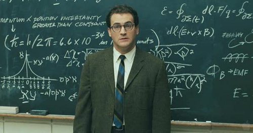
What if you had a full-time job that you could get done in less than 40 hours a week? I’ve never really had one of those, but I’ve rarely had a 9 to 5 job, either. Most of my gigs (the ones I’ve really liked, whether writing for a daily newspaper or walking and boarding dogs) have averaged more than “full time” because the hours are not fixed — that is, they are always in flux, somewhere between “flexible” and “unpredictable.” In part, they involve being constantly “on call” — available for unforeseen events. Drop everything: The death of a famous filmmaker requires a career-spanning obit/ tribute/ appreciation right now! A beagle with diarrhea demands comparably urgent attention, and a Great Pyranees with the same problem compels quick, decisive action no matter what hour of the day or night it is. There’s no such thing as overtime (or “time off,” really, either). That comes with the job.

At Zero for Conduct, film critic and former Village Voice staffer Michael Atkinson asserted the following about those whose job it is to cover the movie front:

I’d love to see every magazine employ an army of full-time culture reviewers, and pay them millions, but it doesn’t make very much sense, for the simple reason that it’s not truly a full-time job….

December 14, 2012

Alien in “3D”: Just one frame

(or, Who put the mise in the mise en scène?)

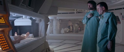
UPDATE: Here’s a new, more color-accurate frame grab — an unmodified screen capture from the new-ish Blu-ray set of the “Alien Anthology.”

Look at the frame-grab above from Ridley Scott’s “Alien” (1979). I’m not making any high claims for it as a masterpiece of composition, or saying that it has great meaning in the context of the movie, or that it expresses anything typical/archetypal about Scott’s style or values (aesthetic, moral). But it sure is a pleasure to take in. You’ve got the interplay between the right, left and center, the foreground and the background, each in its own space, but visually interrelated. The camera is in the operating room with Dallas and Ash, who are looking at their comatose patient, Kane, whose feet are at left, in a quarantine chamber (because he has a xenomorph hugging his face). In the background, through the window, is the rest of the Nostromo crew, anxiously waiting for news. That’s right — the entire (human) cast of the movie in one shot.

We can hear what the crew is saying as well as what Dallas and Ash are saying (exactly what they’re saying is not terribly important, just their worry and uncertainty), though it’s not clear if they can all hear one another. The drama is expressed visually: Kane is immobilized, isolated, beyond reach; Dallas and Ash are the intermediaries between his living death (in quarantine) and life, as represented by the rest of the crew, but they don’t know what to do; the crew is on the outside looking in, twice removed from Kane who was, until just a short time ago, one of them.

December 14, 2012

TIFF 08: The Coens Who Came In From the Cold

In a Coen Brothers movie every pause and stutter, every “um” and grammatical (mis-)construction, every repetition and idiosyncratic pronunciation, is inscribed like a note on a musical staff. The composer-conductors write the music, indicate the pitch, tempo and duration of each passage, and the select musicians — soloists and ensemble players — attack their assigned parts with the virtuoso flair for which they are known. As composers have often written works specifically suited to the talents of their favorite musicians, so the Coens frequently write roles tailored to the individual actors they want to work with.

“Burn After Reading” is a deft little piece, directed with a straight face and performed with a roiling comedic energy that matches brio with precision. That’s what makes it funny. Emmanuel Lebezki’s cinematography, Carter Burwell’s score, Roderick Jaynes’ editing (yes, we all know that’s a pseudonym) could proudly serve any modern espionage picture. All serve a ridiculously plotted absurdist farce, which is what the best spy stories usually boil down to, whether they’re comic or tragic.

December 14, 2012

Moonrise Kingdom: Wes Anderson’s miniatures

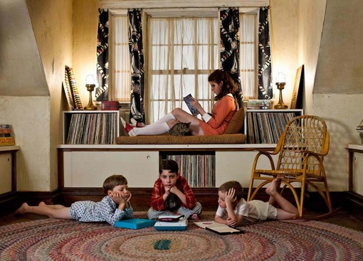
Tilt-shift photography was made for Wes Anderson, even if he doesn’t actually use it. His pictures often look like they were filmed that way, because they are exquisite miniatures. Keith Uhlich and any number of others have referred to his “shoebox-diorama” aesthetic. There’s a hand-crafted feeling to his movies (too bad George Harrison already used the name “Handmade Films”), from the props and set design to the images themselves, a sense “Moonrise Kingdom” underscores with the use of Super 16mm film stock and a softly aged, yellowed visual texture.

The picture begins in what appears to be a toy house with tiny people living inside — reminiscent of the cutaway ship set in “The Live Aquatic with Steve Zissou” (or Jerry Lewis’s famous construction for “Ladies’ Man”). The site is New Penzance Island, 1965 — somewhere, I would imagine, on a fantasy border between New England and France,* probably across the water from Tativille on the mainland. The postal address (clearly marked on the mailbox) is “Summer’s End.” The movie is obsessed with charts and maps and measurements and procedures and codes — all those things that (supposedly, at least) help you figure out where you’ve been, where you are, where you need to go, and what you need to do to get there.

And, the narrator (Bob Balaban, looking like a grey-bearded bespectacled elf in a bright red coat, black and white mittens and a green stocking cap) tells us, looking us right in the eye, it is indeed early September, just three days before a famously ferocious and well-documented tempest, according to the U.S. Department of Inclement Weather, which keeps track of those sorts of things. I would estimate that 98 percent of the time (I wish I had a graph), Anderson’s camera is situated on a tripod or a dolly, moves only at right angles, and always with clockwork smoothness. (There’s a Keatonesque boat that sets sail with a similar comically pure, precise and idealized motion that I can only describe as deadpan. It’s miraculously urgent and serene at the same time.) The dolly-mounted camera can move left or right, up or down, forward or back, except when it pivots (from 180 degrees to 360 degrees) from a fixed point. The compositions, as you know from “Rushmore,” “The Royal Tennenbaums” and so on, are generally balanced, stable and symmetrical, as if viewed through a proscenium. Lots of straight lines and 90-degree angles; few diagonals, except as parallel lines that appear to converge in perspective.

December 14, 2012

When vaginas attack

View image Love bites.

My review of “Teeth” is in the Chicago Sun-Times and on RogerEbert.com. (Also: “21” and “CJ7.”) Here’s an excerpt:

“Teeth” sinks its incisors into a cross-cultural myth known as vagina dentata. Or, as Juno might call it, “Vaggie D.” Depending on who you ask (not that you should bring it up in polite intercourse), it is said to represent the male fear of castration and of feminine sexuality in general. It also symbolizes the woman’s anxieties about penetration, and/or her desire to devour her mate, who is attempting to fulfill his own bio-mythological destiny by returning upstream to spawn in the womb from whence he originated. (Or, as the movie puts it, “the dark crucible that hatched him.”)

Whether you view it as a primordial image from the collective unconscious or a practical warning against promiscuity, vagina dentata makes an indubitably memorable impression — and an ideal premise for a tongue-in-cheek thriller about uncontrollable urges.

Writer-director Mitchell Lichtenstein’s teen horror-(of)-sex comedy begins with a big visual pun about a different portion of the feminine anatomy: An impressive pair of atomic power-plant silos protrude from the horizon like… you know. The camera tilts down to the lawn of a suburban home where nuclear family fusion is about to occur. Bill (Lenny von Dohlen) and his son Brad (John Hensley) are about to join Kim (Vivienne Benesch) and her daughter Dawn (Jess Wexler) to form a single-household zygote. Mutations ensue….

December 14, 2012

Mad Men: Memories, doppelgängers & phantoms

“It’s the greatest curse that’s ever been inflicted on the human race, memory.”

— Jed Leland (Joseph Cotten), “Citizen Kane” (1941)

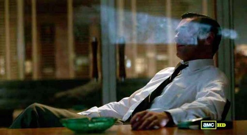
Nearly every scene in “The Phantom,” the Season 5 finale of “Mad Men,” conjures a ghost from the show’s past. “Mad Men,” like many great series from “Hill Street Blues” to “SCTV” to “The Sopranos,” has always been exceptionally good at this (see “The Long Walk”), setting images, gestures and emotions reverberating off one another across episodes and seasons. The series has a memory, and the curse of memory is a primary theme of “The Phantom,” which is why the episode is composed as it is. As Nancy Sinatra sings in that final song:

You only live twice, or so it seems,

One life for yourself and one for your dreams.

(Spoilers from here on out.)

That’s a James Bond theme song, from “You Only Live Twice” (1967) — and it’s the second Bond theme we hear in the episode, after Herb Alpert & the Tijuana Brass bite into Burt Bacharach’s theme from the James Bond parody “Casino Royale” (1967) at the weekday matinée where Don (the suave, masculine Bond of New York advertising) runs into Peggy. (The Beatles, who have figured prominently in Seasons 4 and 5, released “Help!” in 1965 and it was in part a 007 parody, too — especially the John Barry-like orchestral music written by George Martin.) Echoes and repetitions are everywhere.

December 14, 2012

All apologies (and new reviews)

I haven’t been able to post as much as I’d like recently (and I’ve got some real juicy Opening Shots waiting) because I’ve been so busy doing reviews for the Chicago Sun-Times and RogerEbert.com, to help pick up some of the slack while Roger is resting and recovering. (See message from Chaz here — kind of a teaser trailer for Roger’s own progress reports!) This week I’ve got reviews of Woody Allen’s “Scoop” and Betty Thomas’s “John Tucker Must Die.” You’ll never guess which one I thought was funnier. I’ve already written three more for next week: “Little Miss Sunshine,” “The Night Listener” and “The Descent.” More about that last one, especially, in the next few days…

December 14, 2012

Ebertfest photoblog: Day 3

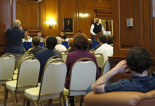
Meta: Writer-director Charlie Kaufmann (“Synecdoche, New York,” right) watches David Bordwell (left) take a photo of the “Far-Flung Correspondents” panel (center, rear).

Roger Ebert introduces the ” Far-Flung Correspondents” panel, moderated by Omer Mozaffer (Pakistan via Chicago, right).

December 14, 2012

The reviews are in: Let the Funny Games begin!

View image Nudge-nudge. (2008)

UPDATED (03/15/08)

(My review of “Funny Games” is here. See also Your User’s Guide to Movie Violence, a discussion below.)

* * * *

“You Must Admit, You Brought This On Yourself”

— advertising tagline, and line of dialog, from “Funny Games” (2008)

“Funny Games” (the 2008 Hollywood movie-star version of the virtually identical 1997 Euro-version) is a conceptual work, an aestheticized test. It’s debatable whether the movie (already a replica) is necessary, except as an object that represents the larger concept — like, say, an Andy Warhol Brillo box or Jeff Koons’ vacuum cleaners in plexiglass cases.

View image Wink-wink. (1997)

You could say something similar about the high-concept “Snakes On a Plane,” and you’d be right. The difference is that the marketing campaign behind the packaging of “Snakes On a Plane” was designed to sell exactly the entertainment experience that the title promised. With “Funny Games,” there’s a deliberate element of bait-and-switch involved. It’s being sold as entertainment, but that’s not at all what it intends to deliver. The experience of “Funny Games” exists in the tension between the pitch and the delivery — which will largely determine the relationship between the viewer and the film he/she sees.

So, the promotional materials for “Funny Games” (poster art, trailers, online videos, etc.) are more than the usual extensions or enhancements of the movie. They frame the experience, but they’re also essential elements of the movie itself. Why you decide to watch it (or not) is every bit as central to the movie’s concerns as anything in the movie itself. That may be true of any movie, but “Funny Games” puts it right there in the foreground where you can’t miss it.

View image Promotional art for the 1997 version.

If you go expecting entertainment and are entertained (or, at least, terrified — held hostage by your own expectations), that will be one thing. If you go expecting a moral lesson about the appeal of violence in movies, and you feel chastened and sullied, that will be another. If you go expecting a thriller or a comedy and find nothing thrilling or funny about it, that will be something else. If you go expecting to be toyed with and, say, enjoy feeling that you’re ahead of the movie (maybe because you’ve already seen the 1997 version), that will provide yet another experience. If you value writer-director Michael Haneke’s other work and want to see why he’s chosen to remake this one… well, I hope you get the idea.

So, the first part of the experiment involves your decision to participate or not. The movie is the second part.

December 14, 2012

TIFF: The Pervert’s Guide to Cinema

Slavoj Zizek in the wake of Melanie Daniels, crossing Bodega Bay in a small motorboat.

At 150 minutes, in three parts, “The Pervert’s Guide to Cinema” (catchy title, no?) is probably the fastest-moving, most shamelessly enjoyable film I’ve seen in Toronto so far this year. There is no story, and only one character — but what a character he is. He’s Slavoj Zizek (more precisely, Žižek), Slovenian philosopher and psychoanalyst, and he comes across as a delightfully unhinged Freudian maniac, the sort of heavily-accented mad doctor who might narrate an Ed Wood movie. But, believe it or not, he’s the real thing. (I Googled him to be absolutely sure, and now I can’t wait to read more of, and about, him.)

And what he does as narrator of this film (directed by Sophie Fiennes, sister of actors Ralph and Joseph) is talk — and talk and talk and talk — about movies. He’s terrific at it, too. Turns out the good doctor is quite the cinephiliac (with a strong Freudian/Lacanian bent, natch), and in what feels almost like a two-and-a-half-hour free-association, he lets his brilliant and facile mind wander through many of the greatest films ever made — with a heavy concentration on Hitchcock (emphasis on “Psycho,” “Vertigo” and “The Birds”), David Lynch (“Lost Highway,” “Blue Velvet,” “Mulholland Drive,” “Wild at Heart”) and Andrei Tarkovsky (“Solaris,” “Stalker”). One image, one idea, flows into the next, which makes for an intoxicating strain of film criticism.

This isn’t quite the first film of this sort (“A Journey Through American Cinema with Martin Scorsese” springs to mind) — but there ought to be more. The genre of movies about movies — in-depth appreciations and evaluations of films that go beyond clip reels like “That’s Entertainment!” into something deeper and, well, more entertaining — is something I hope will blossom over the next few years. It’s something I’ve been thinking about a lot: Film criticism needs to expand beyond mere words, and make better use of other media, including the web and film/video itself, where the images themselves can be seen while they are analyzed.

December 14, 2012

Bordwell covers coverage

View image A shot from Steven Soderbergh’s “The Good German.”

David Bordwell has a capacious post (with 23 illustrative images) beautifully assaying the Hollywood custom of coverage — basically, the industry practice of “covering” a scene by shooting it from plenty of angles, from master to close-up, so there are lots of options in the editing room. He’s following up, and expanding upon, Dave Kehr’s New York Times article on Steven Soderbergh’s decision to shoot his film “The Good German” as if it were a Michael Curtiz studio production in the late 1940s. (Bordwell discusses lenses and lighting in a previous post.)

In Kehr’s illuminating article, actor Tobey Maguire says “what was fascinating to me is how [Soderbergh] was cutting the movie in his head. There’s really no fat on the film. He really didn’t do ‘coverage.’ He only shot the parts of the scene he was going to use, and if he wasn’t going to use it, he didn’t shoot it.”

But the description of traditional coverage in the article — involving shooting with multiple cameras — isn’t the classical Hollywood method, which would be to re-shoot at least parts of the scene again and again from different angles, usually involving extensive re-lighting (and even slightly different blocking) for each new lens and camera position. It’s part of what makes actors go stir crazy waiting in their trailers/dressing rooms between set-ups.

Don’t miss Bordwell’s elaboration on the subject, with quotes from his own interviews with filmmakers and a fascinating analysis of a strange and awkward passage from George Stevens’ “Giant.” This is another example of why the Bordwell-Thompson blog (launched only months ago) is such a welcome addition to the cinematic blogosphere!

December 14, 2012

A Serious Man and His Music

Nobody makes movies as richly and densely composed as the Coens. I’ve said it before that when I’m watching one of their films it’s like being exposed to the distilled essence of cinema, and it makes me realize how anemic and unfocused most movies are. They pack a world of information into their words and images, but they also find the music within them. Their movies sing, every dimension in harmony or counterpoint with every other. Their soundtracks, created with the collaboration of sound designer Skip Lievsay and composer Carter Burwell, are the most vibrantly imagined anywhere. In “No Country for Old Men” they created soundscapes that served as the score, even though very little of it was actually music (beyond a few tones that almost subconsciously quiver beneath certain moments).

David Schwartz has a superlative interview with Carter Burwell at Moving Image Source, in which he talks about the thrilling sonic dimensions of “A Serious Man.” Burwell has worked with the Coens for a quarter century, and they’re all in tune with one another’s genius:

Before the Coens had even cut more than a reel, they called me to say that they’d like me to start working on a piece of music that comes out of a story told entirely in Yiddish in some unspecified old world and leads right up to the opening bar of Jefferson Airplane’s “Somebody to Love.” The idea was that during this transition from the shtetl to the Jefferson Airplane, you’re traveling through the ear canal of this boy in Hebrew school. It’s a dark and mysterious tunnel, and when you finally get to the end it turns out that it’s the earpiece of his portable radio through which he’s listening to Jefferson Airplane. That was the first piece of music I wrote for the film.

December 14, 2012

I’m Not There: Ode to Joy

View image Jude Quinn. Bob Dylan. Mona Lisa. (Cate Blanchett.) Enlarge and see. The eyes, the mouth, the verge of a smile.

The message may not move me,

Or mean a great deal to me,

But hey! it feels so groovy to say…

— Peter, Paul & Mary, “I Did Rock & Roll Music” (1967)

The sun’s not yellow

It’s chicken

— Bob Dylan, “Tombstone Blues” (1965)

I listen to Bob Dylan for the music, not the words. I know: heresy. But it’s the truth: I listen to him for the way he sounds, and that includes the sound of the words. The literal meaning of the lyrics, or what people used to call the “message” (if one can be found or deciphered), is secondary, just one dimension of his art. In his 1960s folk-pop-culture ascendance, Dylan’s songs were scrutinized for coded messages — supposedly embedded “between the lines,” as die-hard folk-popsters PP&M put it in their satirical ditty about the superficiality and commerciality of rock ‘n’ roll music. That pop-culture illusion — that Dylan and the Beatles were sending out encrypted signals into the collective consciousness, and especially to you — is something Todd Haynes plays around with quite a bit in “I’m Not There” — a pseudo-documentary/biopic not unlike his “Superstar: The Karen Carpenter Story,” but with six actors playing Dylan instead of Barbie dolls playing The Carpenters.

But before we get to that: No, I’m not at all knocking Dylan as a poet or a lyricist. (I read Ezra Pound and T.S. Eliot and e.e. cummings for their music as much as anything else, too.) If Dylan’s words weren’t so satisfying to sing out loud, he wouldn’t be much of a songwriter, would he? I mean, how does it feel to sing “How does it feel?” It feels fantastic, that’s how. The black bile of those spleen-venting, “finger-pointing” songs (“Like a Rolling Stone,” “Positively 4th Street,” “Ballad of a Thin Man”) can be so cathartic. All those playfully cryptic, electric-surrealistic rhymes in “Subterranean Homesick Blues” (cue cards, anyone?) can make you dizzy with delight. A simple couplet like, “They sat together in the park / As the evening sky grew dark,” doesn’t look like all that much on the page, but you hear Dylan sing it and you feel a spark tingle to your bones.

What I mean to say is that, even if Dylan were writing in a language no one else on Earth knew (and sometimes I think that’s exactly what he means to do), his great songs would still be great songs. Take Beethoven’s Ninth Symphony. Do you need to know the meaning of the words in Schiller’s “Ode to Joy” to appreciate the fusion of vocal and orchestral sounds in the last movement?

O Freunde, nicht diese Töne!…

Freude, schöner Götterfunken,

Tochter aus Elysium,

Wir betreten feuer-trunken,

Himmlische, dein Heiligtum!

Deine Zauber binden wieder,

Was die Mode streng geteilt;

Alle Menschen werden Brüder,

Wo dein sanfter Flügel weilt.

Admit it! It feels so groovy to say! (Or sing.) I feel the same way about “My warehouse eyes, my Arabian drums,” and “Awop-bop-a-loo-mop alop bom bom” (by Dylan’s idol Little Richard) and “Beat on the brat with a baseball bat” (The Ramones) and “A mulatto, an albino, a mosquito, my libido” (Nirvana).

December 14, 2012

The Birds is coming

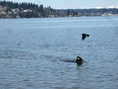
Melanie Daniels (Tippi Hedren) is momentarily distracted by a swooping avian creature as she heads for shore on Bodega Bay. Edith Olive Eggplant Dog (with tennis ball in mouth) is momentarily distracted by a swooping avian creature as she heads for shore on Lake Washington.

UPDATE BELOW:

December 14, 2012

Opening Shots: The Conversation

From Nathan Marone:

It begins high above Union Square in San Francisco and by the time it ends, nearly three minutes later, the opening shot of Francis Ford Coppola’s 1974 film, “The Conversation”, will hone in on one as-yet-unidentified man.

The slow descending zoom, looking down at a cheerful park, full of people, seems at first unobtrusive. Credits roll in the lower right corner of the frame, directing our gaze to the sunlit left hand side. Here, from a distance, we are able to observe a wide variety of people, but it is a very active mime that commands the most attention. All of this seems very normal until about the 1:15 mark, when a strange bleeping noise disorients the viewer. It comes and goes quickly, but will return, unexplained, several times throughout the shot.

This sound is our first indicator that something more than casual observation or location setup may be going on here. The second indicator comes when the camera intentionally settles on the action of the mime, who soon begins to follow and imitate a middle aged man dressed in a grey raincoat. The camera stays with these two for a little while. The mime continues his act while the man is totally dismissive. Soon the mime gives up on the uninterested man and steps out of the frame, leaving the camera to hold on him until the shot is over.

December 14, 2012

Tex Avery: Escape from Alka-Fizz

“Boo.”

Dennis at Sergio Leone and the Infield Fly Rule has posted his favorite Tex Avery cartoon, “Rock-a-Bye Bear,” in response to posts by Peet Gelderblom and That Little Round-Headed Boy, who remarked that this exchange has turned into a sort of spontaneous de-facto Tex Avery blog-a-thon. Well, include me in!

The naughty fairy tale “Red Hot Riding Hood” and “King-Size Canary” are treasured classics, but one of the funniest ‘toons ever, for my money, is “Northwest Hounded Police,” (1946) starring Droopy Dog as Sgt. McPoodle of the Mounties. Its surreal sensibility anticipates “Duck Amuck” (Chuck Jones, 1953) by way of “Cops” (1922). Only instead of the wanted man being pursued by a whole stampede of cops (they accumulate, like the avalanche of boulders and brides in “Seven Chances”), he’s hounded by what an extraordinarily persistent Droopy. The nightmare logic is relentless — and part of what makes it so funny is that it’s also creepy and anxiety-inducing…

UPDATE: After watching “Rock-a-Bye Bear” on Dennis’s site, something struck me (and it wasn’t a mallet or a club or an anvil): It’s built upon the same recurring gag as Abbas Kiarostami’s “The Wind Will Carry Us.” Yep, that fancy-schmancy Iranian artiste has been stealing from Tex Avery! One involves a dog repeatedly running out into the snow to make noise; the other involves a man repeatedly running out into the desert to get cell phone reception.

December 14, 2012

Whose fingerprints are on ‘Touch of Evil’?

Frame from the opening shot — of a pre-1998 version.

C. Jerry Kutner’s contribution to the Contrarianism Blog-a-Thon (“Why Murch’s ‘Touch of Evil’ Doesn’t Make the Cut!”) is generating some discussion over at Bright Lights After Dark. You should look into it.

Meanwhile, Jerry offers an update:

As it turns out, I wasn’t the first person to object to Murch’s version in print. Someone who commented at our blog noted that:

Chris Fujiwara covered some of this ground on the late, lamented, Hermenaut.

And after reading Fujiwara, I agree with him about Murch’s intercutting Susie’s first encounter with the Grandi’s with a scene between Vargas and Quinlan: “One wonders whether if Welles had been allowed to recut the sequence as he wanted, he might not have struggled with it only to conclude that the Susie scene played better uninterrupted.” – Another reason not to like the Murch cut!

The specific changes that were made [from Welles’ memo] are detailed by Laurence French — though oddly no mention is made of the recropping — which I consider to be the Murch cut’s most unforgiveable flaw.

I’ve read that “Touch of Evil” was shot “open aperture” (as many films are) at the standard “Academy ratio” (of 1.33:1 — or 1.37:1 for sound films, from about 1932 through 1953) even though the “intended” ratio when projected may have been 1.66:1 (mostly a European standard) or 1.85:1. The latter format was used for the 1998 “Touch of Evil” DVD which, Kutner argues, chops the top and bottom off Welles’ carefully composed full-ratio 35mm images. Normally, if a 1.85:1 film is improperly projected at the standard ratio, filling the screen from top to bottom, one usually sees boom microphones protruding into the upper part of the frame and other indications that one is seeing things that weren’t intended to be seen. That’s how you know it’s the projectionist’s fault, not the filmmakers’. But this was never the case with “Touch of Evil.” (Stanley Kubrick [“Eyes Wide Shut”] and James Cameron [“The Abyss”] are among the directors who, it is claimed, have composed at least some of their video-era films in wide screen and “full screen” ratios simultaneously, so the image would fill pre-16:9, non-HDTV television screens without losing anything.)

Indeed, in a May 24, 1958, letter to the editor of the New Statesman of London (reprinted at the bottom of French’s second page), Welles writes:

There was no attempt to approximate reality; the film’s entire ‘world’ being the director’s invention. Finally, while the style of TOUCH OF EVIL may be somewhat overly baroque, there are positively no camera tricks. Nowadays the eye is tamed, I think, by the new wide screens. These ‘systems’ with their rigid technical limitations are in such monopoly that any vigorous use of the old black-and-white, normal aperture camera runs the risk of seeming tricky by comparison. The old camera permits use of a range of visual conventions as removed from ‘realism’ as grand opera. This is a language not a bag of tricks. If it is now a dead language, as a candid partisan of the old eloquence, I must face the likelihood that I shall not again be able to put it to the service of any theme of my own choosing.As I read this, Welles states his clear preference for the “old black-and-white normal aperature” over the “new wide screens” that were introduced in the 1950s (along with new widescreen processes such as VistaVision, CinemaScope and the like) — and with regard to “Touch of Evil” in particular. The question (as one correspondent has posed it) was whether Welles really thought he could get away with making a 1:33:1 picture in the late 1950s. But even if he didn’t, he knew the prints would retain that ratio. And the 16mm prints shown by universities and film societies were full-frame. So, he must have known that the film was being seen that way before he died in 1985. I wonder if either of the early versions of “Touch of Evil” was on VHS or laserdisc by then…

UPDATE: Christian Liemke offers some 1:33:1/1.85:1 “Touch of Evil” frame comparisons here.

December 14, 2012

Coding in pictures: The Social Network

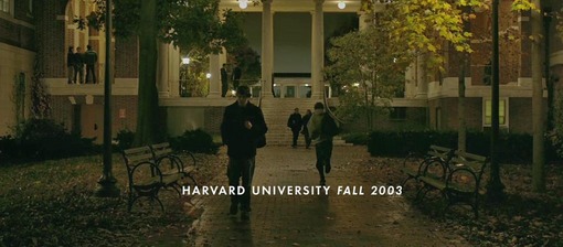
The first thing that happens after Erica (Rooney Mara) breaks up with Mark Zuckerberg (Jesse Eisenberg) in “The Social Network” is that he goes back to his residence hall. It’s a long, long walk, even though Mark takes it at a clip that’s closer to running. Why, after the rapid-fire skirmish in the opening scene, would the movie take so long to simply get Mark from the Thirsty Scholar, just off-campus, to Kirkland House?

Well, for one thing, it’s an opportunity to roll the opening credits. But at one point this was envisioned as the most extravagant sequence in the picture — and that’s saying a lot, given that it was directed by David Fincher (“Fight Club,” “Zodiac,” “The Curious Case of Benjamin Button”). According to Michael Goldman’s cover story in the October issue of American Cinematographer, the whole trek was designed to be accomplished in one long take, with multiple cameras stationed along the route. The footage (if you can still call it that, when the images are being captured on 16GB CF cards) would then be stitched together in post-production to create one seamless shot. There’s even a satellite map of the course in the magazine.

December 14, 2012
subscribe icon

The best movie reviews, in your inbox