My favorite documentary of 2007 (which I haven’t had a chance to write about yet) is Gary Hustwit’s “Helvetica,” a look at a ubiquitous typeface. It’s the kind of movie that helps you to see the world around you anew, freshly attuned to all the fonts in your world. Me, I’m a Helvetica guy. I hate fonts that call attention to themselves, and Helvetica is so clean and strong and elegant you can do almost anything with it just by varying sizes, colors, weights, spacing and placement. Our good friend Larry Adylette, the superlative movie and music and pop culture blogger formerly known as The Shamus (and, before that, That Little Round-Headed Boy), has a few words on Helvetica (and “Helvetica“) over at his new blog, Welcome to L.A. — which is also the title of Alan Rudolph’s funny-peculiar 1976 debut feature, starring Keith Carradine, Sally Kellerman, Harvey Keitel, Sissy Spacek, Lauren Hutton, Geraldine Chaplin, Viveca Lindfors and Richard Baskin. (A parenthetical time-out to say: “Hello, Larry!,” as they used to remark on NBC for a very short time in 1979-80 after McLean Stevenson left “M*A*S*H,” thus providing Garry Shandling with a great network-meeting joke in an early episode of “The Larry Sanders Show.”) Larry writes:
Just like film bloggers who parse every frame of “No Country For Old Men,” these font fanatics have obsessed about every curve and dimension of Helvetica. To them, Helvetica is either a perfect, easily readable form of mass communication or something akin to Anton Chigurh with a coin and an air-tank gun. They are an argumentative, often hilarious bunch…
I have no idea what he’s talking about.
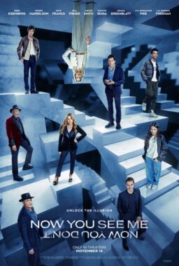
But that’s not really the reason for this post. It’s about an entirely different (serif) font, Trajan, which as Kirby Ferguson of Goodie Bag details in the above movie, has become the movie font. “Trajan is the movie font,” he says — and then goes on to show you so many examples your head will spin. In the end, though, like me, he’s a Helvetica guy. Look at those end credits. Not Trajan. Helvetica. I’ll write more about “Helvetica” later, because I’m fascinated with it (the font and the movie) and I already want to see it a third time.
(tip: Ali Arikan)
P.S. Karsten (in comments below) offers an explanation for the film-font phenomenon with a link to this animated murder mystery, “Etched in Stone.” (link opens new browser tab/window)

