.syn{font-family:Arial;font-size:11px;padding:5px;width:470px;background:#585858;border-top:1px solid #777777;color:#ccc;} .syn a {color:#ccc;}
A few notes on the obnoxious visual style of the otherwise mildly enjoyable new “Star Trek” movie:
Let us agree on one thing: No lens flares on the bridge of the USS Enterprise, OK? It’s stupid, it’s distracting, it’s ugly, it’s a pointless waste of cinematic energy, and (like much of the overactive camera- and CGI-work in the new “Star Trek” movie) it makes multi-million dollar sets and effects look unbelievably chintzy.
“Star Trek,” Gene Roddenberry’s great humanistic science-fiction enterprise (original network TV series, Earthdate 1966-69; original Kirk/Spock movie series, 1979-91), always featured cool technology (phasers, transporter room, warp drive) but it wasn’t mainly about the science and it certainly wasn’t about sophisticated eye candy. The characters were the primary special effects and the best scenes took place on the main set, the cockpit of the ship.
“Star Trek” offered a hopeful, Kennedy-esque vision of mankind’s noblest space-travel aspirations — motivated by goodwill, curiosity and a thirst for knowledge to seek out new life and new civilizations. We felt the future was in good hands because Kirk, Spock, McCoy, Uhura, Sulu, Chekov, Nurse Chapel and the crew were good people.
J.J. Abrams’ “Star Trek” reboot movie gets some things right, beginning with fresh and appealing faces as the rookie Enterprise crew on the ship’s maiden voyage. (John Cho as Sulu! Yeah!) But, damn, could this movie use a director. (I know, I said the same thing last summer about “TDK,” and I meant it then, too.) Abrams began as a screenwriter (“Regarding Henry,” “Forever Young,” “Armageddon“) and has become a one-man network television franchise as a series creator and producer (“Felicity,” “Alias,” “Lost”). But if you ever want to see what a movie directed by someone with the soul of a producer looks like, start with the works of Irvin Winkler (“Guilty By Suspicion“) and then catch this one.
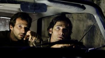
Don’t get me wrong — it’s a fairly pleasurable if less-than-engaging trip, but Abrams has no idea of what to do with the camera other than to keep reminding you that it’s always there, always screaming “Hey, look at me!,” always obtrusively inserting itself between you and whatever it is you’d rather be looking at. I came away from this movie feeling frustrated, like I’d spent the whole time trying to peer over, under, or past a camera operator who was constantly standing in my way, blocking my view of the action. (See clip above. Actors: fun. Camerawork: annoying beyond all logic. However, there is a good reason Spock is so full of emotion in this scene — and it’s not just because he has a headache from that Costco lighting, which was on Kirk’s dad’s ship, too.)
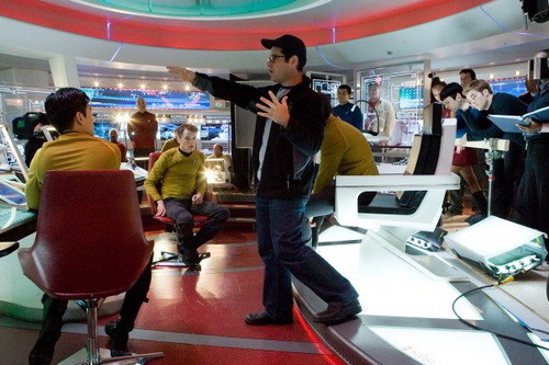
Actually, that’s where you’d think the producer’s credo — put the money on the screen — would serve the movie well. But shining white lights into the lens during dialog scenes on the bridge just throws you out of the moment. How could anybody command a starship under such lighting? The hand-held, senselessly whip-panning camera is at eye level, yet blinding white spots keep washing out all or part of the image for no discernable purpose. (Sadly, you get a better view of the bridge of the Enterprise in the above production still, showing Abrams on the set, than in the movie itself.)
Another simple thing to keep in mind, so as to avoid reducing obviously expensive effects to the level of amateur home video footage: When showing opticals, miniatures or CGI — especially when they are supposed to exist within the gravitational fields of planetary atmospheres — do not, DO NOT program complex twisty-turny “camera movements” that no actual camera would or could ever make. It just calls attention to the shot’s inherent phoniness. In other words, just because you can send the camera hurtling through the air, upside down or sideways, is — in and of itself — not a good reason to do so. All it accomplishes is to make the more attentive members of your audience notice the shot, and perhaps the labor that went into it, rather than what they’re supposed to be looking at, which is whatever’s happening in the world of the movie. There’s a shot of a Starfleet ship leaving Iowa in broad daylight that is so needlessly complex you forget what the shot is about. All that effort just to make plain old earthbound Iowa look unconvincing.
If, in the middle of an action sequence (or, god forbid, what ought to be a simple establishing shot), the viewer is thinking, “Look at those special visual effects,” then the effects are badly done. You want them to accept the reality of what’s on the screen — “Look out for that Romulan ship!” — not to be sitting back and thinking, “Why is the camera upside down?” or, even worse, “Oh, look, we’re back to CGI again,” like that Monty Python “Exterminating Angel” sketch where the characters are trapped on video inside a house and surrounded by film outside. Somebody needs to go back and look at “2001: A Space Odyssey” or “Blade Runner” or “Alien” or “Terminator 2” to see how to build a believable world that incorporates visual effects.
Want to move the camera all the time? Why? Watch Robert Altman’s 1973 “The Long Goodbye.” You may not notice that the camera was always in motion, and that’s a good thing. Because you feel it anyway. It makes you uneasy, uncertain, like the sand on the beach that’s always shifting beneath your feet as the waves come rolling in. There’s no firm place to stand in this anachronistic Philip Marlowe Los Angeles. Like the city itself, you can never quite get a fix on what’s going on, because this world has no center and you’re most likely to be catching glimpses of the unstable landscape through a picture window or from inside a moving car. Vilmos Zsigmond’s camerawork isn’t a special effect, it’s a moral vision.

I recently had the pleasure of spending several days going through Ramin Bahrani’s “Chop Shop” with the director and Roger Ebert at the Conference on World Affairs in Boulder. Before the end of the first shot (well, actually there’s an invisible cut during a perfectly natural — not attention-grabbing whip-pan — to the back of a white pickup truck that’s pulling away from the curb. Bahrani pointed to a soccer ball sticker on the rear of the truck and said it represented a two-hour argument between him and his brilliant DP, Michael Simmonds. Every element in a composition (especially the movement of the camera itself), Bahrani explained, draws energy. The question of whether to include or not include a particular detail (an object, a motion, a dash of color, a flash of light) comes down to whether it’s worth the visual energy it draws. What does it contribute? Why should it be there? What if it weren’t? Would that give more focus to the film’s energy?
This is one of the things that makes Bahrani a first-rate filmmaker, and what helps make his movies stimulating and alive rather than dull and exhausting like most films churned out by today’s indie and Hollywood hacks. How I wish other directors paid half as much attention to what they’re throwing up on the screen as Bahrani does.
But back to “Star Trek” and its signature image: the USS Enterprise. The ship itself is surely the most exquisitely designed vehicle in the history of science fiction — sleek and awe-inspiring, part bird, part rocket, part flying saucer. My heart leaps a bit when I see it. The undying, optimistic message of “Star Trek” is simple: The civilization that created this magnificent ship will survive, will defeat those who try to expunge it from the universe, because it is capable of imagining this. Form follows function, emotion harmonizes with logic. The Enterprise is dwarfed by the senseless black grotesquerie of the Romulan ship, but “Star Trek” believes unshakably that elegance and reason will triumph. It’s that simple. All the rest is space junk.
This Shakespearean pean to homo sapiens (removed from its despairing context) expresses the soaring humanism of “Star Trek” for me:
What piece of work is a man! how noble in reason!
how infinite in faculty! in form and moving how
express and admirable! in action how like an angel!
in apprehension how like a god! the beauty of the
world! the paragon of animals!
UPDATE: Matt Zoller Seitz nails it once again at The House Next Door:
I wanted more patience, more concentration from the movie at certain points. I appreciate the desire to keep things moving, but sometimes I missed the original series (and film series’) willingness to just stand still for a moment and contemplate the characters and situations… […]
If Abrams would just make up a goddamn shot list for fight scenes and dialogue scenes (or direct as if he actually had one — I’m sure he did have one here, because the film was too expensive to wing it) he’d immediately jump right to the top of my list of juggernaut showmen. I like the shaky-cam, pseudo-doc style when it’s done with panache and an overriding sense of form plus content (the “Bourne” films were brilliant examples of the style; though the handheld work was derided as haphazard, look closely and you’ll see that every move, every cut has rhythmic purpose, that the movie is actually going for something and achieving it). Here it just seemed lazy and of-the-moment. (Abrams is capable of better; he directed the pilot for “Lost,” which was distinguished by some of the best move-to-reveal dolly shots this side of early Spielberg. Maybe he was pressed for time and had to run-and-gun to get through the shooting schedule? Or maybe he’s just being fashionable?)
I’m not a fan of the overused “run-and-gun”/shaky-cam pseudo-verite style, which I think actually owes more to mid-period MTV and ’80s TV commercials than documentary filmmaking. I’m impatient with it mainly because it’s such an intrusive, unimaginative cliche — and has been at least since Oliver Stone took it to its illogical extreme in “Natural Born Killers” fifteen years ago. All this aimless, hyperactive motion, signifying nothing — except, perhaps, the filmmakers’ fear that the only way to hold the audience’s interest is with senseless movement. (The belabored adoption of this MTV-outgrowth style as late as the 1990s and 2000s amounts to a tacit admission that the filmmakers don’t think the story and characters are sufficiently developed to command attention on their own.)
In music videos the flailing camerawork, non-sequitur quick-cutting and random appropriation of various film stocks and video formats had the effect of making the images endlessly repeatable. You never quite saw enough of what you wanted to see; you paid extra attention trying to catch a glimpse of the flash-images that most intrigued you. But music videos were, generally speaking, not primarily narrative filmmaking. They were designed to provide associative imagery to accompany music and lyrics. When you apply the approach to storytelling, you’d better have a well worked-out idea of what you’re trying to convey and why.