As far as I’m concerned, that’s the sub-head of the year — for the first section of Greg Ferrara’s perfectly observed (and, for me, exhilaratingly cathartic) Cinema Styles blog post, Five Years, Five Peeves, Five Reasons to Go On. It’s so sharp (and not just when I happen to share his point of view) and funny that I feel like offering an annotated response. You should read the whole thing (I couldn’t even get past the first item without stopping to leave an enthusiastic comment), but I will refrain… sort of. There’s a lot to consider here. Lemme just hit some of the highlights:
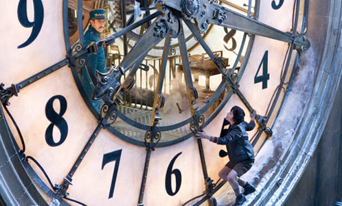
I have a problem with a lot of modern cinema. I don’t like the way most of it looks, I don’t like the way it’s edited (too choppy and frenetic) and I don’t like the way it’s acted (so painfully naturalistic that a wide range of performances are thoroughly interchangeable). And I have that feeling with a frighteningly high percentage of modern movies. But mostly, I have a problem with the way the movies look. And when I say I have a problem, I mean even with movies I like. We all know I don’t like CGI very much (I even do a series on special effects before CGI took over) and this is a big problem because it’s now everywhere, in practically all movies. Take “Hugo,” directed by Martin Scorsese. I use this movie as an example because it was a movie I liked and thus, I can assure you it is not me reacting to a movie I hate or using it as an excuse to hate the movie. No, I liked “Hugo” but I hated most of the look of it.
For months, even before it was released, I found myself feeling a strange reluctance to see “Hugo” (2011). I still haven’t seen it, but I plan to do so in the next week or so — though I’m surprised to find that I am not looking forward to the latest Martin Scorsese Picture. Why? I hadn’t quite put my finger on it until I read Greg’s piece. It’s because I hate the frothy, cotton-candy look of the stills I’ve seen. I compared the look of “Avatar” to Thomas Kinkade and Thai restaurant fiber-optic flower lamps (remember Michael Atkinson’s priceless protest: “What, am I a forest animal, unthinkingly hypnotized by shiny objects?”).

<iframe width="510" height="289" src="http://www.youtube.com/embed/KaqC5FnvAEc?rel=0" frameborder="0" allowfullscreen="“>
As I said back then, the “uncanny valley” in “Avatar” wasn’t so much the Na’vi as the actual valley. The whole planet of Pandora, in fact, which was just close enough to photorealism that it constantly reminded you of how utterly fake it was. That’s the problem with most CGI these days: anything is possible, and nothing is believable. As Roger Ebert recently said about “The Polar Express” (a movie he liked very much), it constantly called your attention to the fact that you weren’t actually seeing Tom Hanks as the conductor. In the case of “Avatar” or the clip above, the impossible camera movements underline the uncanniness. It might be easier to suspend disbelief if it all took place on the old Monogram Pictures backlot — at least if it was actually photographed with a real camera.
(Animation is swell. I like animation. But it hasn’t had much to do with photography since the days of the Multiplane camera. Much of what I treasure about movies has to do with photography — the recording at a particular place and time of real objects in front of a lens, not a virtual world created in a computer. Even though photography can also be tweaked and manipulated, optically or digitally, it still remains rooted in the recording of light in three dimensions, and that’s what I like most about movies.)
The fussiness of the imagery (though it’s quite a different look) is also what initially put me off seeing Clint Eastwood’s “Flags of Our Fathers,” a movie that turned out to be quite good. I loathe the pretentious, desaturated cinematography Eastwood has used habitually since “Million Dollar Baby,” mostly because it makes everything look like CGI — or, worse, early Ted Turner digital “colorization” attempts.

I try not to pre-judge (and I will see “Hugo,” just as I eventually saw “Flags of Our Fathers”), but I can’t pretend that I don’t react negatively to certain visual styles I think have become overly mannered or clichéd. (The pseudo-documentary handheld camera, anyone?) The look of a movie is at least as important as who stars in it — maybe more so for somebody like me, who likes to watch. Not to get ahead of Greg’s piece, but this reminds me of something I saw by Vadim Rizov, a writer I enjoy reading. In a capsule comment in his online movie log, he wrote about David Cronenberg’s “A Dangerous Method“:

… most of this is just very literal talk, so dull I checked out and started dissecting Cronenberg’s shot choices hoping to find some kind of framing preference. Indeed, whether indoors (walls) or outdoors (buildings), he likes to have a crisp vertical line bisecting the background somewhere in the middle of the frame, with whatever surfaces are there forming a right angle roughly cradling the foreground into two crisp segments. See also Amy Taubin on his two-shots with “a somewhat wide-angle lens that flattens space, making the actor in the foreground seem disproportionately large in comparison to the actor in the background […] to reveal something about subjectivity: how one’s self-involvement can dwarf one’s perception and comprehension of the other, or vice versa.” True, and it’s that kind of visual thinking I don’t do enough of, so it’s not like “A Dangerous Method” was a total waste of time: through its general lack of interest, it forced me to do the visual work. Win?
Well, yeah, I would say that’s a *win* — for the viewer and for the film. I loved the talk, and “A Dangerous Method” was one of my favorite movies this year (on and off my various “ten bests,” but always a contender) very much because of Cronenberg’s visual strategies. The way I see it, it’s more like: If you aren’t looking at how the frames are composed, and how the shots are put together, then what are you looking at? That’s the fun of movies! (BTW, this is reminds me of another thing I hate about CGI: When any angle or “camera” movement is possible, what does it matter where the digital “camera” goes? It all feels programmed and weightless, anyway.)


Now, I’m not sure that’s exactly where Vadim was going with his observation, but I want to say that part of the thrill of “A Dangerous Method” for me were those “talk therapy” two-shots. Too many filmmakers shoot dialog scenes by rote — all tiresome reverse angles and over-the-shoulders. Dull, dull, dull. I found what Cronenberg was doing with foreground/background and (Rohmer-esque!) side-by-side framings pretty exciting to watch, sending a visual charge through the passionate talk. As Kathleen Murphy said about all that talk: “ideas aren’t dry abstractions; they’re as disturbingly alive, as wildly subversive as those phallic phages in ‘They Came From Within.’ Playing Jung and his creatively crazy patient Sabina Spielrein, Michael Fassbender and Keira Knightley almost literally take fire as they fall into what T.S. Eliot called ‘passionate ratiocination,’ when thought and talk become as erotic and perverse a pleasure as their carnal intercourse.”

Well, now I’ve strayed quite a ways from Greg’s piece to some of my own peeves, but he has more to say about that Uncanny Valley through which all CGI roads invariably lead, in “Rise of the Planet of the Apes“:
You want to talk about being taken out of the film? I was taken out of the film. Ninety percent of this movie looked like a fair to competent rendering of a cut scene on the latest PC game technology. Caesar, the lead ape character, never, ever, ever, EVER looked real to me.
But that’s not the problem. The problem I’m having is I don’t understand why everyone else isn’t bothered by the awkwardly, physically wrong feel of CGI representation and movement of living things. How is it that anyone thought the apes in the movie looked good?
Let me say it again from a different angle. I don’t doubt “Rise of the Planet of the Apes” uses the most advanced CGI technologies available to it, I’m saying that even the best CGI representations of mammals look like crap. And when I say “crap” I mean, doesn’t look visually connected to the rest of the action. In other words. optically printing a stop-motion creation over a live-action scene looks more “together” to me than a CGI overlay. Everything starts to look airbrushed, like the actors are real and they’re walking around with this fantasy-art performance piece, and the physics, the mechanics of motion, never seem quite right either. Close, yes, but far enough off that they distract. And it’s as frustrating to me as when I go to someone’s house and they’re watching an Academy-ratio movie or tv show on a widescreen tv, stretched out, and don’t notice or care about the difference.
Yes, yes and yes. I felt very much the same way. I liked some of the concepts for the images and sequences, but was disappointed in their execution. The whole idea of the uncanny valley is that the closer something gets to reality, the more disturbing its shortcomings become. It’s easy to look at a simple cartoon and accept it as an abstract simulacrum of reality, but it’s harder to suspend disbelief when you’re seeing something that’s close but not quite reality.


Also, I really didn’t like all the anthropomorphizing, especially of Caesar. I would love to get behind a movement to honor motion-capture performances like Andy Serkis’s, but the director of this movie made him play a man in a chimp suit. I realize that Caesar was an exceptional chimp, but who taught him to act — Charlie Chaplin? His humanoid facial expressions and body language looked like they were aimed at the Curious George set (although parts of this movie are absolutely not for tots). But his face and body moved more like a human’s than a chimpanzee’s. Sure, it was awfully considerate of Caesar to make all those People Faces for the camera so we could easily follow what he was feeling at any given moment, but even a chimp can overemote. Once again, the effects in “2001: A Space Odyssey” still appear to have been light years ahead of their time: those apes were emotionally powerful creatures who still behaved like apes.

Krishna Bala Shenoi, a young filmmaker and one of Roger Ebert’s Far-Flung Correspondents, recently published a long piece about “the great movies of my childhood” in which, among many other joys, he contemplates the stop-motion animation of the legendary Ray Harryhausen:
While most kids in the 90’s would be oblivious of stop-motion (with CGI growing popular), I was in awe of it. There is a sense of life in stop-motion animated creatures. It’s the kind of life that much of CGI lacks. No matter how smoothly or realistically your computerized monster moves, there is something more subtle that stop-motion captures better. Harryhausen’s creations seem to be thinking, or feeling, not just moving. They have personality, an attribute that so many of today’s CG monsters lack.
Also, no matter how crude a stop motion model might be, it still exists. It occupies space and has weight. The Transformers, no matter how many cars they bump into and send flying, aren’t really there, and many times, they seem to be walking ‘through’ space, not occupying it.
One more thing that gives stop motion animation a distinction from other forms of animation is the dream like quality it has. While 2005’s CGI “King Kong” was a wonderful work of modern CGI special effects, the 1933 film has a nightmare quality to it that CGI will never achieve. Look at the realistic Pegasus from the recent remake of “Clash of the Titans” and then look at Harryhausen’s version. Tell me, which one left you smiling?

Krishna nails it — and most eloquently, too. The other thing I keep coming back to, because it’s so important to me, is that stop-motion is still photography. Did I mention that I prize the photographic aspect of cinema best of all? (BTW, I made a little frame-by-frame animated film called “Still Life” in the early 1970s with my father’s 8 mm Kodak Brownie movie camera, by flicking the button on the front to expose one or two frames at a time. It wasn’t an exact science, but it worked. And my first star was a white gooseneck desktop lamp who scurried around a pool table hungrily devouring balls. And he had personality. So there, Pixar!)
Well, I do seem to have strayed some distance from Greg’s piece and wandered into a few of my own peevish cul-de-sacs. But there’s more! I will get to some of Greg’s (and others’) concerns about auterism and criticism and civility and backlash and grudges (and David Fincher and Christopher Nolan) in a soon-ish post…
(Thanks — or something — to Omer Mozaffar for the Trolling Saruman in Glorious CGI.)


