It’s hard to believe that in all the years of covering short films that I had yet to write about one based on a classic short story. Herman Melville’s “Bartleby” (first published in 1853) has been adapted into two features, but the story works perfectly well as a 10-minute, wordless, animated short. True to the original story (mostly), this new version offers no clues into the inner workings of one of the most frustrating and baffling co-workers anyone could ever encounter. He’s an anomaly, a paradox and seemingly not from our world, except that he looks human, knows how to land a job, where to show up for work and can wear a tie.
But he’s functional: When Bartleby shows up for his first day at work in a Wall Street office to do some mundane data entry, he does so at great speed that puts all the other workers to shame. He talks to no one. He has nothing to say, but he can do the work, at least until he “prefers not to,” a phrase that will haunt the boss man in charge for the rest of his days. “I prefer not to” is the only answer Bartleby will give when asked to do his work or show up for a meeting. He has simply stopped and refuses to budge. He also never leaves the building. He remains stuck in the corner and requires no help from anyone.
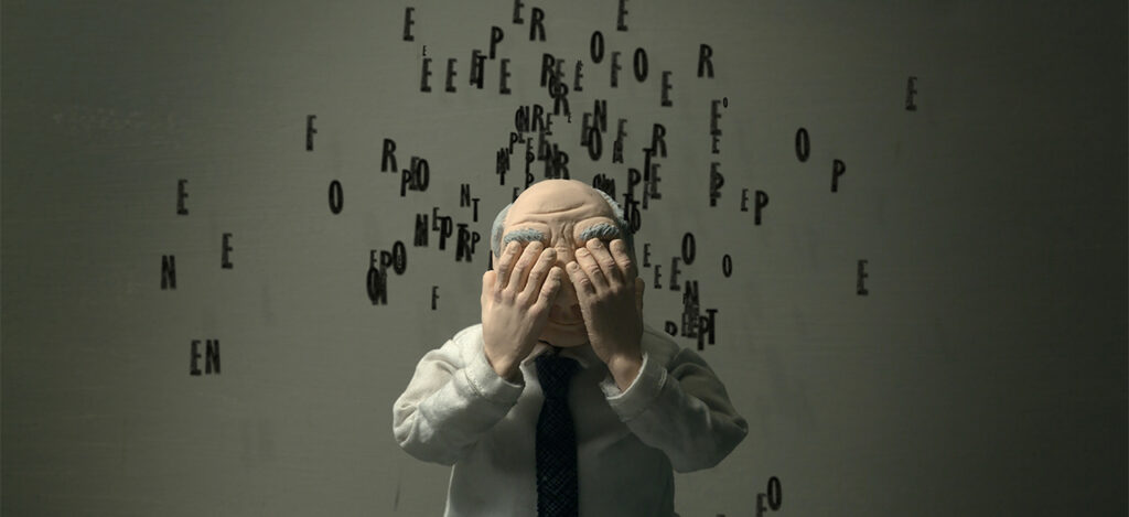
Directors Laura Naylor and Kristen Kee have modernized “Bartleby” for the age of computers and email, making Bartleby’s behavior that much more confounding. They have also smartly chosen to tell the story almost entirely visually—when characters speak, letters spill out from their mouths, sometimes forming words, while we hear the sounds of old printers and fax machines take the place of human voices. This reminded me of another claymation marvel, Aardman’s “Shaun the Sheep Movie,” which also did away with dialogue in favor of grunts and mumbles. It works especially well here, because what else do we need to hear from them besides those four annoying words?
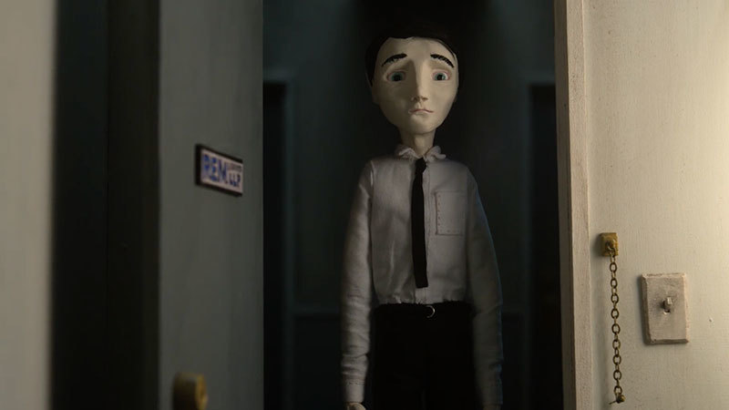
Naylor and Kee have made a wonderful adaptation that is laced with dark humor and a real sense of tension and despair at having to deal with this oddball. The character renderings are perfect. Bartleby himself looks like a human blank page and the boss looks like the kind of guy who has seen it all—until today. “Bartleby” is a story maybe we’ve seen or read before, but this version, like Melville’s original story, will still have some mysteries and unanswered questions by the end, but nothing that will feel unsatisfactory. Decades after first reading Melville’s story and seeing the 1971 version, I still have no idea what Bartleby’s deal is and that’s just the way it should be.

How did this project come about?
KRISTEN KEE: We were both smitten with Melville’s “Bartleby” and with the medium of stop-motion. One thing Laura and I bonded over early is we were both raised Mormon, but dropped out as young adults. Right around the time I was thinking about leaving the church, I found Bartleby—the idea of preferring not to make a ton of sense from that angle. In a stubborn, teenage way. Fast forward several years, both of us out of art school working drab office jobs in midtown, with art as a side hustle. We both definitely preferred not to spend all day in cubicles, and almost literally rediscovered Bartleby as a kind of self portrait. So that’s how we came to the story. On the medium, Laura’s background was in film, and mine was in sculpture, so stop-motion seemed to be this perfect intersection of our skill sets. And with Bartleby as stop-motion, there’s also a beautiful rub: you have a lead character who prefers, by the end, to essentially do nothing, and we’re telling his story in this incredibly time and labor intensive medium. It’s a perfectly backwards choice because there is no “preferring not to” in stop-motion. Plus Melville’s Bartleby is so open-ended, and so ambiguous in its visuals, it was ripe for an experimentation-friendly, build-your-own-reality medium like stop-motion. We kept asking ourselves, “how does this not exist already?!”
Where did the idea of the floating letters and dialogue come from?
LAURA NAYLOR: We wanted to layer in repeated references to the physical world of text, to Bartleby and Melville’s world and to the way we both first experienced the story. On a more abstract level we were also trying to have the text effectively become a character of sorts. The animated letters were also this great tool we could play with to express the mounting tension between Bartleby and his boss. The mutated, evolving text hive also points to some of the liberties we took with the story itself (setting it in ~2011 Wall Street, adjusting names/genders of characters, changing the ending). Frankly, it was also a kind of elegant and hacky solution to one of the constraints of stop-motion—specifically, it’s incredibly time and labor intensive to animate speaking parts in stop motion, so making the film “silent” enabled us to actually, well, make it at all.
What sounds are we hearing in place of dialogue?
KK: The audio you hear when the characters are speaking is sampled from old, early tech printers. That was another way for us to subtly allude to Bartleby’s literary and textual origin story. The printer sounds were actually the brainchild of our amazing sound and music team, Deniz Cuylan and Brian Bender of Bright + Guilty. We were kind of shocked by how rich the collaboration with them was. We would give those guys notes—a couple of artists and a few tonal descriptors (minimalist, dissonant, occasionally wistful, saggy with ennui)—and they’d consistently come back to us with clearer, purer, better versions of what we’d tried, but largely failed, to describe. We felt like we lacked the vocabulary to articulate what we wanted, but they understood us anyway. They made the film so much better.
The lighting here looks very specific. What were some of the challenges (if any) related to the lighting?
LN: Our wildly talented DP, Zach Poots, lights a stop motion set like you would a live-action film: lots of practical lights (all of lamps and computer screens actually emitted real light), lots of lights shining in windows from all angles, just all teeny tiny. One of the main challenges with stop-motion is the tight quarters (working on a set ~1/8 the size of humans), and Zach had to figure out a place to put all the lights while still leaving our awesome lead animator, Josh Mahan, room to manipulate the puppets. When you’re lighting 20,000 photographs that will be stitched together to create a film, consistency is key. Bumping a light during the middle of an all day 8-10 second shot could mean starting over from the beginning! Zach was a master at the fun technical stuff, too, like creating lightning and TV flicker by calculating shifts over a series of photographs. Kristen’s and my directorial vision was to create the rich, subtly moody, jaundiced palette you see in the final film without over-indexing on those dark creepy vibes—and ending up in some uncanny valley of horror or pastiche. It was also fun to use lighting shifts to echo the interior world of the characters. For example, as the employer starts unraveling, the lighting breaks from realism and reflects his exaggerated, fractured fears.
I like that you kept the original names. Were there any other elements of the original story you felt you had to get just right?
KK & LN: So many things! One big one was maintaining Bartleby’s enigma-like nature. We didn’t want to over-explain him, or narrate away the many possible interpretations of the original story. We also really wanted to retain the dynamic between Bartleby and his boss that Melville drew so well. Bartleby’s boss—who does not have a name in the book, thus we named him REM after Melville’s description of him as a “rather elderly man”—has a wide and complicated range of reactions to Bartleby’s refusals, and we were really trying to capture the full spectrum. We also loved some of the little details, things like the Roman statesman bust, Nippers’ irritability, Turkey’s drinking problem, and the little partition that separates Bartleby from the rest of the office (“the green screen” as we called it). The things we felt comfortable tweaking (time period, gender, REM’s death fantasies, ending) were the components we felt weren’t integral to those core character traits or to the meat and bone of the story. Our editorial adjustments were meant to extend and amplify, more like asking vs answering questions about Bartleby’s story. What does “preferring not to” mean in contemporary Wall Street vs the developing Wall Street of the mid 19th century? Questions like that.
What’s next for you?
LN: I’m in post-production on an observational documentary feature following a group of laborers who harvest grapes every year at a famed champagne domaine, but am eager to jump into another stop-motion project soon.
KK: I’ve been focused on (non-animated) neon sculpture and learning Javascript for an upcoming generative art exhibit, but am also working on a stop-motion script about young mormons. Would love to dive back into animation when this wraps!